Friday, January 10, 2014

3rd Marking Period


 Assignment #21

          
          This assignment was an introduction to using Google Sketch-up. In this assignment, we were required to familiarize ourselves with the basics of the program. Once we had a basic understanding, we had to create a 3-dimensional model of a triangle, a rectangle, a cylinder, and then write out our name using 3-dimensional models.


Assignment #22

Block # 1

 8 x 5 x 5

Block # 2


 8 x 5 x 5

Block # 3


 9 x 4 x 6

Block # 4


 7 x 6 x 4

Block # 5


 8 x 5 x 5

Block # 6


 8 x 5 x 6

Block # 7


 8 x 5 x 6

Block # 8


 8 x 5 x 6

Block # 9


 9 x 4 x 6

Block # 10


 11 x 3 x 6

Block # 11


 8 x 5 x 6

Block # 12


 9 x 4 x 6

Quiz Block


 8 x 5 x 6

          The goal of this assignment was to be further familiarized with the functions of Google Sketch- up. This was achieved by creating a series of 12 blocks followed by the final one which was a quiz to test our mastery by modelling a more advanced block. 

Assignment # 23


          Using the skills learned from assignments 21 and 22, we were given a greater challenge. Our goal, to find an image of a gingerbread house and create a life-sized 3-dimensional model of  whatever it was that we found.


Assignment # 24


          Building on assignment #22 is assignment # 23. The goal was to create a 3- dimensional effect when 3-d glasses were used. We first start by finding an image that will be our background. Then we export our gingerbread house as a 2-d graphic to be used in Adobe Photoshop. By making a copy of our gingerbread house, we only allow the red mesh to show on top while on the bottom we only allow for the blue and green mesh to show. 

Assignment # 25


         The goal of this assignment was to create a simple animation of a glowing button. The basics were to first create the button in its non-glowing state using a number of blending options. We created a group of these layers and then copied that so we could use another set of blending options to create the button in its glowing state. The animation came about by using the animation tools, and having the two states to start off with. To smooth out the animation we added a 5 layer tween, copied and then reversed  the layers and finally set the delay to zero. This button was uploaded as a .gif or graphical interchange format which is a compressed version of the original image that made it easier to upload.

Assignment # 26a


          In this assignment, our goal was to create a showcase room for our favorite item. The steps to achieve this were to make 6 boxes, doing a perspective transform to turn the boxes into a room. By using different gradients, we cast the illusion that there was depth to the room. The next step was to make the lighting effects, achieved by creating one ellipse and another inside that ellipse and then adding a gradient to the outer one leaving the inner one white. We added two ellipses on the floor and back wall and blurred those white then drew a trapezoidal shape out of the light to represent the beam and added a blur to that as well. 

 Assignment #26 b


          This part of the assignment was mainly about adding in the item to be showcased. I simply took an image of the front and back views of a white Samsung Galaxy S4 and then the back view of a black one. Using the brush tool, I then added a simple shadow to the three images that I added.


Assignment #27


          This is the final assignment of the multimedia course. In this assignment, we revisited Microsoft publisher which we used for the first assignment. The end result is a brochure outlining the Manhattan Center for Science and Mathematics and the classes that I take which are just a few of the classes that you can take. Students have all rights to go wherever they want to go for lunch outside of the building.

Reflection

          In this course we have used 5 main programs, Microsoft Publisher, Microsoft Powerpoint, Adobe Photoshop, Adobe Illustrator, and Google Sketch-up. Originally, we presented our work through turning a powerpoint presentation in .jpeg files and uploading them. Through using these programs I've learned not to trust all pictures as original because I have learned the various ways in which a picture can be edited. I've been given the tools which I can use to edit my own photos instead of paying someone to do it. In addition, using these programs has provided another creative outlet because now I can be abe to edit boring pictures and add exciting backdrops to them. Sketch-up is also something that I enjoying toying with from time to time as a way to design architectural pieces. I've learned how to create 3-dimensional images from scratch using both Illustrator and Sketch-up and how to make simple animations and 3-dimensional effects using Photoshop. In addition I will now be able to use publisher in a business environment to advertise the overall brand that I display.

Friday, October 18, 2013

2nd Marking Period

Noche de Ciencias Flyer Redesign #11

                   To make this flyer from scratch, what I did was to first create the Noche de Ciencias text by first using the text tool and then using a few blending options on the text such as a drop shadow, Inner shadow,  outer glow, inner glow, bevel and emboss, color overlay, and satin. I again used to text tool to insert the 5 W's for this event. After doing so I found an image on Google of the stem logo, saved it to the desktop and opened it in Photoshop. I copied the image over to the flyer and transformed it to be proportional with the rest of the flyer. I used the outer glow to make the image blend with the rest of the flyer. I finally used the text tool again and overlaid the stem text into the image and gave that text an outer glow.

Changing a Suit's Texture #12


               In this assignment, we found a picture of a suit and found a picture of a texture. We overlaid the texture and fitted it to the shape of the suit so that the suit would now be seen in that texture.


Change One Thing Poster #13


                This is the official Change One Thing poster for the NYC food bank. The different aspects of this poster that classify this as multimedia are the combination of text, and the images.

               This is the poster that I created to mimic the official poster. The "new food" was created by overlaying a subways foot long sandwich onto a Burger King  wrapper. The background is a solid color and the blending options used in this poster was an outer glow for the "new food" and the NYC food bank logo.


Disclaimer: The NYC FOOD BANK Logo was used solely for educational purposes. No Copy Right infringement was intended. 

Halloween Project #14


            In this assignment, I combined the vampire and bloody method effects of Photoshop to create a Will Smith inspired vampire. The vampire effect was the easiest part as all I needed to do was select and transform the teeth into fangs. I then desaturated all areas of the face except for the eyes and small areas around the eyes. Moving the burn tool over the eyes completed this effect. The bloody method was created using the magic wand, changing the feather and messing around with the Gaussian blur to get the most realistic effect.

Creating a Painted Look Using Displacement #15a


            To create this assignment, I created the effect of the Jamaican flag painted on a brick wall. I opened up both the image of the brick wall and the flag in Photoshop and then added them to the same canvas. By placing the flag layer above the brick wall layer and then using a hard light, the flag wall was visible behind the flag. Next I duplicated the brick wall layer, desaturated it and then brought it above the flag layer. a Gaussian blur was applied next, followed by creating a displacement map of the flag.the displacement map was then applied and given a hard light and an opacity change to 80% to finish the effect.

Creating a Painted Look Using Displacement #15b


            In this assignment, the same steps were followed as in part a, only the brick wall layer was replaced with a face.

Assignment #16


          In this assignment, we found a picture of a form of transportation and opened it up in Photoshop as a smart object.  We applied a motion blur, masked the object and then used the brush tool to exempt the vehicle from the blur.

Assignment #17


          In this assignment, we found a picture, quick-masked the object and then isolated a section. The isolated section was then made available for manipulation and a read tint was simply used to change the object.

Assignment #18


          In this assignment we added a soft glow to a portrait. By converting the object to smart filters,using a Gaussian blur, and then airbrushing areas like the eyes and other features, the effect was achieved.


Assignment #19 USB Drive

                                             
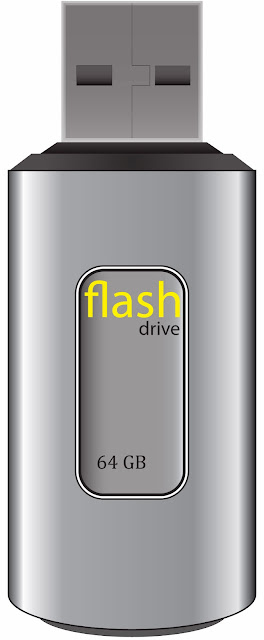
      In this assignment, we used Adobe Illustrator to create a photo-realistic USB flash-drive. By creating a number of rectangles, rounded rectangles, ellipses and then adding a gradient to mimic the way light would react on the drive the desired image was achieved.


Assignment #20 Wireless Phone


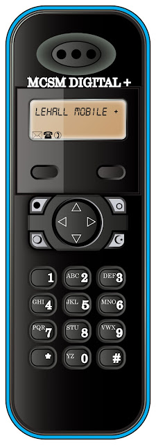
         Much like in assignment 19, we again used Adobe Illustrator to create a photo-realistic object, in this case a wireless phone. The desired effect was achieved by essentially completing a series of creating a number of rounded rectangles and ellipses, adding a gradient to the created shape, off-setting the paths of these shapes and then adding a gradient to that.