Noche de Ciencias Flyer Redesign #11
To make this flyer from scratch, what I did was to first create the Noche de Ciencias text by first using the text tool and then using a few blending options on the text such as a drop shadow, Inner shadow, outer glow, inner glow, bevel and emboss, color overlay, and satin. I again used to text tool to insert the 5 W's for this event. After doing so I found an image on Google of the stem logo, saved it to the desktop and opened it in Photoshop. I copied the image over to the flyer and transformed it to be proportional with the rest of the flyer. I used the outer glow to make the image blend with the rest of the flyer. I finally used the text tool again and overlaid the stem text into the image and gave that text an outer glow.
Changing a Suit's Texture #12
In this assignment, we found a picture of a suit and found a picture of a texture. We overlaid the texture and fitted it to the shape of the suit so that the suit would now be seen in that texture.
Change One Thing Poster #13
This is the poster that I created to mimic the official poster. The "new food" was created by overlaying a subways foot long sandwich onto a Burger King wrapper. The background is a solid color and the blending options used in this poster was an outer glow for the "new food" and the NYC food bank logo.
Disclaimer: The NYC FOOD BANK Logo was used solely for educational purposes. No Copy Right infringement was intended.
Halloween Project #14
In this assignment, I combined the vampire and bloody method effects of Photoshop to create a Will Smith inspired vampire. The vampire effect was the easiest part as all I needed to do was select and transform the teeth into fangs. I then desaturated all areas of the face except for the eyes and small areas around the eyes. Moving the burn tool over the eyes completed this effect. The bloody method was created using the magic wand, changing the feather and messing around with the Gaussian blur to get the most realistic effect.
Creating a Painted Look Using Displacement #15a
To create this assignment, I created the effect of the Jamaican flag painted on a brick wall. I opened up both the image of the brick wall and the flag in Photoshop and then added them to the same canvas. By placing the flag layer above the brick wall layer and then using a hard light, the flag wall was visible behind the flag. Next I duplicated the brick wall layer, desaturated it and then brought it above the flag layer. a Gaussian blur was applied next, followed by creating a displacement map of the flag.the displacement map was then applied and given a hard light and an opacity change to 80% to finish the effect.
Creating a Painted Look Using Displacement #15b
In this assignment, the same steps were followed as in part a, only the brick wall layer was replaced with a face.
Assignment #16
In this assignment, we found a picture of a form of transportation and opened it up in Photoshop as a smart object. We applied a motion blur, masked the object and then used the brush tool to exempt the vehicle from the blur.
Assignment #17
In this assignment, we found a picture, quick-masked the object and then isolated a section. The isolated section was then made available for manipulation and a read tint was simply used to change the object.
Assignment #18
In this assignment we added a soft glow to a portrait. By converting the object to smart filters,using a Gaussian blur, and then airbrushing areas like the eyes and other features, the effect was achieved.
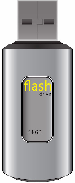
Assignment #19 USB Drive

In this assignment, we used Adobe Illustrator to create a photo-realistic USB flash-drive. By creating a number of rectangles, rounded rectangles, ellipses and then adding a gradient to mimic the way light would react on the drive the desired image was achieved.
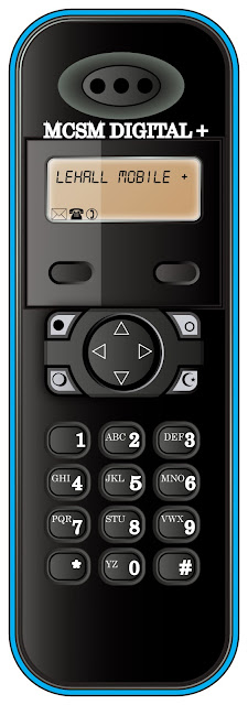
Assignment #20 Wireless Phone
Much like in assignment 19, we again used Adobe Illustrator to create a photo-realistic object, in this case a wireless phone. The desired effect was achieved by essentially completing a series of creating a number of rounded rectangles and ellipses, adding a gradient to the created shape, off-setting the paths of these shapes and then adding a gradient to that.


No comments:
Post a Comment